
I have been thinking about writing a short post on R resources for working with (ROC) curves, but first I thought it would be nice to review the basics. In contrast to the usual (usual for data scientists anyway) machine learning point of view, I’ll frame the topic closer to its historical origins as a portrait of practical decision theory.
ROC curves were invented during WWII to help radar operators decide whether the signal they were getting indicated the presence of an enemy aircraft or was just noise. (O’Hara et al. specifically refer to the Battle of Britain, but I haven’t been able to track that down.)
I am relying comes from James Egan’s classic text signal Detection Theory and ROC Analysis) for the basic setup of the problem. It goes something like this: suppose there is an observed quantity (maybe the amplitude of the radar blip), X, that could indicate either the presence of a meaningful signal (e.g. from a Messerschmitt) embedded in noise, or just noise alone (geese). When viewing X in some small interval of time, we would like to establish a threshold or cutoff value, c, such that if X > c we will we can be pretty sure we are observing a signal and not just noise. The situation is illustrated in the little animation below.
library(tidyverse)
library(gganimate)  #for animation
library(magick)     # to put animations side by side
We model the noise alone as random draws from a N(0,1) distribution, signal plus noise as draws from N(s_mean, S_sd), and we compute two conditional distributions. The probability of a “Hit” or P(X > c | a signal is present) and the probability of a “False Alarm”, P(X > c | noise only).
s_mean <- 2  # signal mean
s_sd <- 1.1   # signal standard deviation

x <- seq(-5,5,by=0.01) # range of signal
signal <- rnorm(100000,s_mean,s_sd)
noise <- rnorm(100000,0,1)

PX_n <- 1 - pnorm(x, mean = 0, sd = 1) # P(X > c | noise only) = False alarm rate
PX_sn <- 1 - pnorm(x, mean = s_mean, sd = s_sd) # P(X > c | signal plus noise) = Hit rate
We plot these two distributions in the left panel of the animation for different values of the cutoff threshold threshold.
threshold <- data.frame(val = seq(from = .5, to = s_mean, by = .2))

dist <-
  data.frame(signal = signal, noise = noise) %>%
  gather(data, value) %>%
  ggplot(aes(x = value, fill = data)) +
  geom_density(trim = TRUE, alpha = .5) +
  ggtitle("Conditional Distributions") +
  xlab("observed signal")  +
  scale_fill_manual(values = c("pink", "blue"))

p1 <- dist + geom_vline(data = threshold, xintercept = threshold$val, color = "red") +
            transition_manual(threshold$val)
p1 <- animate(p1)
And, we plot the ROC curve for our detection system in the right panel. Each point in this plot corresponds to one of the cutoff thresholds in the left panel.
df2 <- data.frame(x, PX_n, PX_sn)
roc <- ggplot(df2) +
  xlab("P(X | n)") + ylab("P(X | sn)") +
  geom_line(aes(PX_n, PX_sn)) +
  geom_abline(slope = 1) +
  ggtitle("ROC Curve") +
  coord_equal()

q1 <- roc +
        geom_point(data = threshold, aes(1-pnorm(val),
                          1- pnorm(val, mean = s_mean, sd = s_sd)),
                          color = "red") +
                          transition_manual(val)

q1 <- animate(q1)
(The slick trick of getting these two animation panels to line up in the same frame is due to a helper function from Thomas Pedersen and Patrick Touche that can be found here)
combine_gifs(p1,q1)
Notice that as the cutoff line moves further to the right, giving the decision maker a better chance of making a correct decision, the corresponding point moves down the ROC curve towards a lower Hit rate. This illustrates the fundamental tradefoff between hit rate and false alarm rate in the underlying decision problem. For any given problem, a decision algorithm or classifier will live on some ROC curve in false alarm / hit rate space. Improving the hit rate usually come at the cost of increasing the probability of more false alarms.
The simulation code also lets you vary s_mean, the mean of the signal, Setting this to a large value (maybe 5), will sufficiently separate the signal from the noise, and you will get the kind of perfect looking ROC curve you may be accustomed to seeing produced by your best classification models.
The usual practice in machine learning applications is to compute the area under the ROC curve, AUC. This has become the “gold standard” for evaluating classifiers. Given a choice between different classification algorithms, data scientists routinely select the classifier with the highest AUC. The intuition behind this is compelling: given that the ROC is always a monotone increasing, concave downward curve, the best possible curve will have an inflection point in the upper left hand corner and an AUC approaching one (All of the area in ROC space).
Unfortunately, the automatic calculation and model selection of the AUC discourages analysis of how the properties and weaknesses of ROC curves may pertain to the problem at hand. Keeping sight of the decision theory point of view may help to protect against the spell of mechanistic thinking encouraged by powerful algorithms. Although, automatically selecting a classifier based on the value of the AUC may make good sense most of the time, things can go wrong. For example, it is not uncommon for analysts to interpret AUC as a measure of the accuracy of the classifier. But, the AUC is not a measure of accuracy as a little thought about the decision problem would make clear. The irony here is that there was a time, not too long ago, when people thought it was necessary to argue that the AUC is a better measure than accuracy for evaluating machine learning algorithms. For example, have a look at the 1997 paper by Andrew Bradley where he concludes that “…AUC be used in preference to overall accuracy for ‘single number’ evaluation of machine learning algorithms”.
What does the AUC measure? For the binary classification problem of our simple signal processing example, a little calculus will show that the AUC is the probability that a randomly drawn interval with a signal present will produce a higher X value than a signal interval containing noise alone. See Hand (2009), and the very informative StackExchange discussion for the math.
Also note, that in the paper just cited, Hand examines some of the deficiencies of the AUC. This discussion provides an additional incentive for keeping the decision theory tradeoff in mind when working with ROC curves by . Hand concludes:
…it [AUC] is fundamentally incoherent in terms of misclassification costs: the AUC uses different misclassification cost distributions for different classifiers. This means that using the AUC is equivalent to using different metrics to evaluate different classification rules.
and goes on to propose the H measure for ranking classifiers. (See the R package hmeasure) Following up on this will have to be an investigation for another day.
Our discussion in this post has taken us part way along just one path through the enormous literature on ROC curves which could not be totally explored in a hundred posts. I will just mention that not long after its inception, ROC analysis was used to establish a conceptual framework for problems relating to sensation and perception in the field of psychophysics (Pelli and Farell (1995)) and thereafter applied to decision problems in Medical Diagnostics, (Hajian-Tilaki (2013)), National Intelligence (McCelland (2011)) and just about any field that collects data to support decision making.
If you are interested in delving deeper into ROC curves, the references in papers mentioned above may help to guide further exploration.
In a recent post, I presented some of the theory underlying ROC curves, and outlined the history leading up to their present popularity for characterizing the performance of machine learning models. In this post, I describe how to search CRAN for packages to plot ROC curves, and highlight six useful packages.
Although I began with a few ideas about packages that I wanted to talk about, like ROCR and pROC, which I have found useful in the past, I decided to use Gábor Csárdi’s relatively new package pkgsearch to search through CRAN and see what’s out there. The package_search() function takes a text string as input and uses basic text mining techniques to search all of CRAN. The algorithm searches through package text fields, and produces a score for each package it finds that is weighted by the number of reverse dependencies and downloads.
library(tidyverse)  # for data manipulation
library(dlstats)    # for package download stats
library(pkgsearch)  # for searching packages
After some trial and error, I settled on the following query, which includes a number of interesting ROC-related packages.
rocPkg <- pkg_search(query="ROC",size=200)Then, I narrowed down the field to 46 packages by filtering out orphaned packages and packages with a score less than 190.
rocPkgShort <- rocPkg %>%
               filter(maintainer_name != "ORPHANED", score > 190) %>%
               select(score, package, downloads_last_month) %>%
               arrange(desc(downloads_last_month))
head(rocPkgShort)
## # A tibble: 6 x 3
## score package downloads_last_month
## <dbl> <chr> <int>
## 1 690. ROCR 56356
## 2 7938. pROC 39584
## 3 1328. PRROC 9058
## 4 833. sROC 4236
## 5 266. hmeasure 1946
## 6 1021. plotROC 1672To complete the selection process, I did the hard work of browsing the documentation for the packages to pick out what I thought would be generally useful to most data scientists. The following plot uses Guangchuang Yu’s dlstats package to look at the download history for the six packages I selected to profile.
library(dlstats)
shortList <- c("pROC","precrec","ROCit", "PRROC","ROCR","plotROC")
downloads <- cran_stats(shortList)
ggplot(downloads, aes(end, downloads, group=package, color=package)) +
  geom_line() + geom_point(aes(shape=package)) +
  scale_y_continuous(trans = 'log2')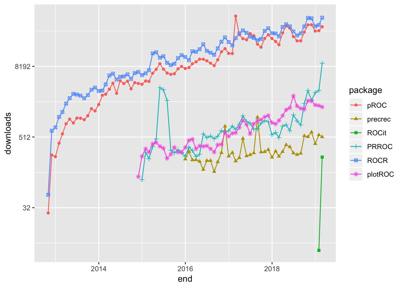
ROCR has been around for almost 14 years, and has be a rock-solid workhorse for drawing ROC curves. I particularly like the way the performance() function has you set up calculation of the curve by entering the true positive rate, tpr, and false positive rate, fpr, parameters. Not only is this reassuringly transparent, it shows the flexibility to calculate nearly every performance measure for a binary classifier by entering the appropriate parameter. For example, to produce a precision-recall curve, you would enter prec and rec. Although there is no vignette, the documentation of the package is very good.
The following code sets up and plots the default ROCR ROC curve using a synthetic data set that comes with the package. I will use this same data set throughout this post.
library(ROCR)## Loading required package: gplots##
## Attaching package: 'gplots'## The following object is masked from 'package:stats':
##
## lowess# plot a ROC curve for a single prediction run
# and color the curve according to cutoff.
data(ROCR.simple)
df <- data.frame(ROCR.simple)
pred <- prediction(df$predictions, df$labels)
perf <- performance(pred,"tpr","fpr")
plot(perf,colorize=TRUE)
It is clear from the downloads curve that pROC is also popular with data scientists. I like that it is pretty easy to get confidence intervals for the Area Under the Curve, AUC, on the plot.
library(pROC)## Type 'citation("pROC")' for a citation.##
## Attaching package: 'pROC'## The following objects are masked from 'package:stats':
##
## cov, smooth, varpROC_obj <- roc(df$labels,df$predictions,
smoothed = TRUE,
# arguments for ci
ci=TRUE, ci.alpha=0.9, stratified=FALSE,
# arguments for plot
plot=TRUE, auc.polygon=TRUE, max.auc.polygon=TRUE, grid=TRUE,
print.auc=TRUE, show.thres=TRUE)
sens.ci <- ci.se(pROC_obj)
plot(sens.ci, type="shape", col="lightblue")## Warning in plot.ci.se(sens.ci, type = "shape", col = "lightblue"): Low
## definition shape.plot(sens.ci, type="bars")
Although not nearly as popular as ROCR and pROC, PRROC seems to be making a bit of a comeback lately. The terminology for the inputs is a bit eclectic, but once you figure that out the roc.curve() function plots a clean ROC curve with minimal fuss. PRROC is really set up to do precision-recall curves as the vignette indicates.
library(PRROC)

PRROC_obj <- roc.curve(scores.class0 = df$predictions, weights.class0=df$labels,
                       curve=TRUE)
plot(PRROC_obj)
plotROC is an excellent choice for drawing ROC curves with ggplot(). My guess is that it appears to enjoy only limited popularity because the documentation uses medical terminology like “disease status” and “markers”. Nevertheless, the documentation, which includes both a vignette and a Shiny application, is very good.
The package offers a number of feature-rich ggplot() geoms that enable the production of elaborate plots. The following plot contains some styling, and includes Clopper and Pearson (1934) exact method confidence intervals.
library(plotROC)
rocplot <- ggplot(df, aes(m = predictions, d = labels))+ geom_roc(n.cuts=20,labels=FALSE)
rocplot + style_roc(theme = theme_grey) + geom_rocci(fill="pink") 
precrec is another library for plotting ROC and precision-recall curves.
library(precrec)##
## Attaching package: 'precrec'## The following object is masked from 'package:pROC':
##
## aucprecrec_obj <- evalmod(scores = df$predictions, labels = df$labels)
autoplot(precrec_obj)
Parameter options for the evalmod() function make it easy to produce basic plots of various model features.
precrec_obj2 <- evalmod(scores = df$predictions, labels = df$labels, mode="basic")
autoplot(precrec_obj2) 
ROCit is a new package for plotting ROC curves and other binary classification visualizations that rocketed onto the scene in January, and is climbing quickly in popularity. I would never have discovered it if I had automatically filtered my original search by downloads. The default plot includes the location of the Yourden’s J Statistic.
library(ROCit)## Warning: package 'ROCit' was built under R version 3.5.2ROCit_obj <- rocit(score=df$predictions,class=df$labels)
plot(ROCit_obj)
Several other visualizations are possible. The following plot shows the cumulative densities of the positive and negative responses. The KS statistic shows the maximum distance between the two curves.
ksplot(ROCit_obj)
In this attempt to dig into CRAN and uncover some of the resources R contains for plotting ROC curves and other binary classifier visualizations, I have only scratched the surface. Moreover, I have deliberately ignored the many packages available for specialized applications, such as survivalROC for computing time-dependent ROC curves from censored survival data, and cvAUC, which contains functions for evaluating cross-validated AUC measures. Nevertheless, I hope that this little exercise will help you find what you are looking for.